INFOPOETRY
[feel the issue]
// Infopoetry is a portmanteau word that combines the words information and poetry.
The main goal of an infopoetry is not only to display a dataset, but also to make people feel the data. In order to accomplish this, an infopoetry matches data visualization with poetry, so it’s a poetic way to display a dataset.//
This definition has been provided by DensityDesign on the website [1] which gathers all the infopoetries realized during the Final Synthesis Course in the Communication Design MA Program at Politecnico di Milano.
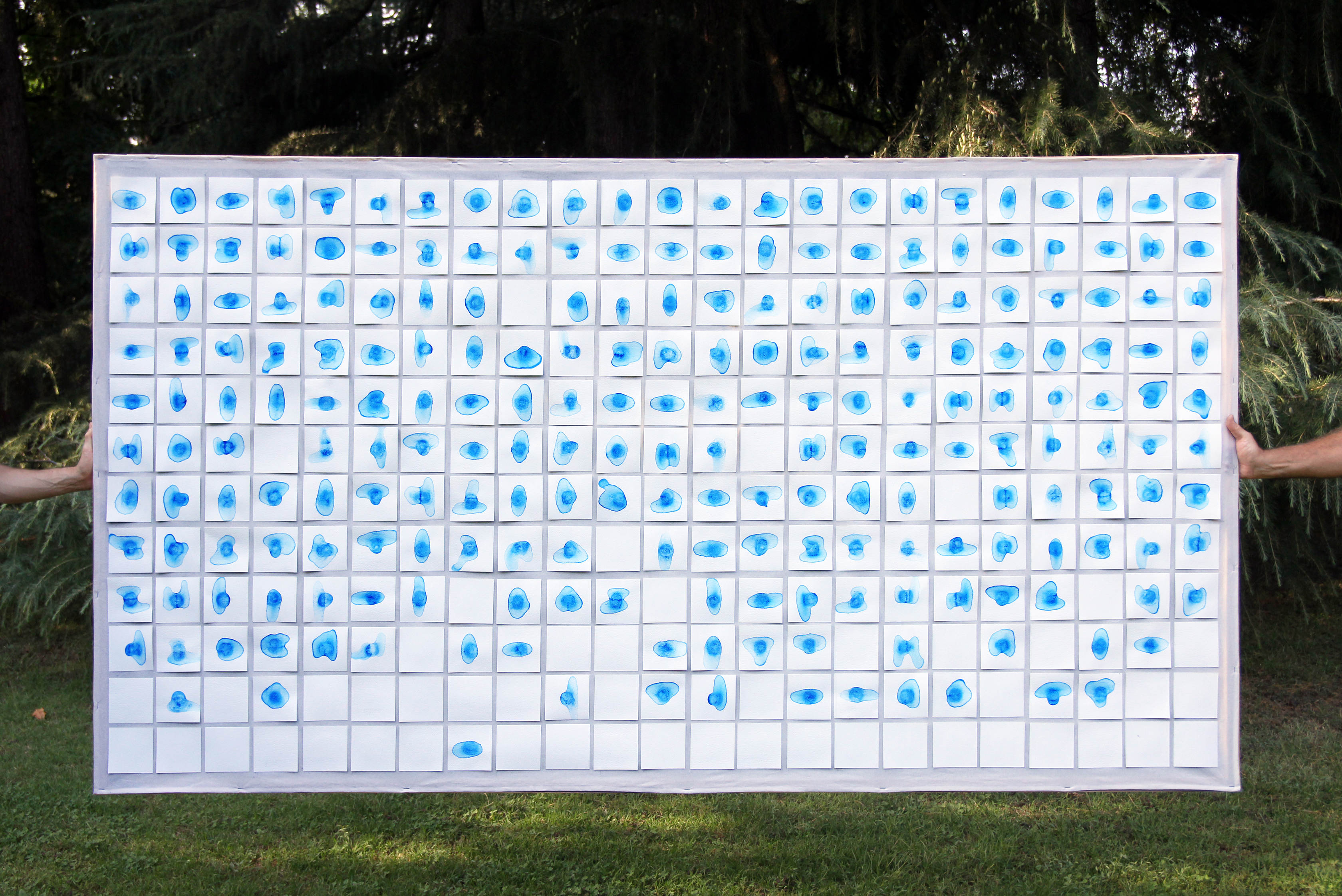
The infopoetry I realized on January 2018 faces the Climate Change Issue, investigating the effects from an aesthetic perspective [2].
I started looking for Iceberg information into different sources which treat the topic from different points of views. I consulted the International Ice Patrol and Ice Service [3],
National Snow and Ice Data Center [4] and
National Ocean Service [5] websites.
I found data describing the Antarctic Iceberg situation since 1978 in the NASA Scatterometer Climate Record Pathfinder [6] website. This project is sponsored by NASA to develop scatterometer-based data time series to support climate studies of the Earth's cryosphere and biosphere.
I downloaded a dataset for each Iceberg and I organized them keeping the useful information to narrate the ice journey.
The Beauty possibility to survive the Climate Change relies on the Iceberg survival which depends on the ice duration. I decided to use ice as the main component of my project, because of this material relevance in the issue. Ice becomes the Iceberg representation symbol, referring to the figure of speech called synecdoche, in which a term designating a part of something refers to the whole of something or vice versa.
Ice has been physically used to recreate a possible effect caused by the melting Icebergs.
I created as many ice cubs as the number of Icebergs reported in the dataset. Then, I let each cub melt on a watercolour paper surface which absorbed the water from the melting ice, leaving a blue spot caused by the tempera I used with water to prepare the cubs.
Each blue spot stands for the effect left by the ice thaw, while white cards symbolize the Icebergs still alive at the time of the representation. For those ones, the dataset shows the time when they broke off from the Antarctic, but not the melting moment.
All the cards are ordered according to the Iceberg break off dates.
DATA VISUALIZATION
[see the data]
While the infopoetry purpose is to engage the audience creating emotions, the goal of this visualization is to communicate more accurate information.
The same dataset has been used. Icebergs, which are depicted as spots in the first work, are now represented by lines.
Each Iceberg is a horizontal line, starting at the Iceberg break off time and ending when the ice completely melts. The line colour is due to the South Pole quadrant from where the Iceberg has been originated.
The curve drawn by the Icebergs break off shows the increasing number of Icebergs originated from 2000.
Different time durations have been registered, as shown by the short and long bars.
A huge quantity of ice has broken off from the North-West Pole quadrant, nominated in the dataset with letter A, while the opposite geographic area, nominated with letter D, is the quadrant producing the least number of Icebergs.
DATA SONIFICATION
[hear the trend]
More than one year after the infopoetry realization, I decided to face the same topic, using the same data, with a different communication method I learned working on my MA thesis project.
I used the Sonification method to approach the same dataset, transforming data into sound. This dataset is suitable to be transformed into sound, because it is built on time period series. So, I considered the first break off date as the second Zero from when the sound track starts. Then, every Iceberg break off has been calculated considering how many days have passed since the break off day of the first Iceberg. I considered the time between the break off and the melting moment to determine the Iceberg life duration.
The numbers obtained were mapped on a four-minute (240 seconds) scale, chosen as the track length. Finally, a specific sound has been assigned to the Iceberg life rhythm, using different pitch values to differentiate the geographic quadrant from where the Icebergs originated.
In this project, the use of sound attempts to integrate the engagement introduced by the first installation. The aim is to make the audience aware of the worsening situation. In this direction, a high amount of sound stimuli reflects the Icebergs increasing number and the ice short survival period. The rhythm arise a melancholy feeling influenced by the awareness of the end of Beauty.
How should melting Icebergs be represented by sound?
How does Beauty destruction sound like?
Bibliography and Data